Sunday 18 October 2009

Celebrating The Ordinary

For my latest University project, I was set the brief to 'celebrate the ordinary'. From the given list, I chose to celebrate elastic. Here is my solution:

Yep, all the sounds were created by twanging elastic bands. Oh and the project, from research to conception, development, filming and editing etc was completed in a week.

I have to finish this post with my favourite piece of work produced. Fellow course mate Matthew produced this film to celebrate the umbrella.

The amount of work put in to create this much stop frame animation in a week is incredible, well done Matt. But more than just a lot of work, this film is funny, moving and just a great piece of story telling.

Friday 9 October 2009

He's just a rascal


I like this shopping channel pastiche that Dizzee Rascal has been using to promote his latest album. I wonder how they got him to look so plastic and still.

Thursday 8 October 2009

Starwars Uncut


This website was brought to my attention by none other than Stephen Fry via his Twitter account. Starwars Uncut invites visiters to remake 15 second clips of Star Wars which will later be strung together to make a complete film. The last I looked there were only 19 free clips left, so you'd better get a move on if you want to get involved. Go and have a look!

Also, from a web design point of view, check out how the stars scroll behind the death star image in the bottom left, nifty.

Data Flow


Data Flow explores the fascinating subject of the way designers can display information and data graphically. The collection of graphs, charts and diagrams range from highly technical to hand drawn but all give intrigue to what is essentially lists of boring numbers.


This book is really inspiring and will really come into it's own next time I need to graphically represent some data – I'm sure that will be soon.

Wednesday 7 October 2009

Antoni Gaudí

In the past three years, I have ended up in Barcelona three times – twice this summer. You can't be a tourist in this amazing city without becoming aware of the architecture of Antoni Gaudí. The impact that this one man had on the city can't be underestimated.


His huge church Segrada Família was started in 1883 and is projected to be finished in 2026 which gives you an idea of its size. Gaudí dedicated the last 15 years of his life to the project.

I love the Art Nouveau look of the facade of Casa Batlló as well as the amazing chimney sculptures.


Another of my favourite Gaudí works is Parc Guell located toward the north of the city.


I love the fluid forms that Gaudí uses and the effect of the broken ceramic that is often used to clad his work. Gaudi died in 1926 when he was hit by a tram. Barcelona subsequently removed trams from its streets.

Gaudí's work has become a symbol of Barcelona, Catalunya and the whole of Spain.

Cinema Redux by Brendan Dawes

In this project, Dawes took eight of his favourite films and attempted to distill them down to a single image.

To do this he wrote a Java programme that, for each second of a film, took an 8 by 6 pixel image. The captured images were then laid out in rows, each row representing a minute in time.

The results create some startling images. This is Scorcese's 'Taxi Driver' from 1976.


Cinema Redux was exhibited at MoMA in New York last year but you can buy prints of the work here if you happen to have $300 going spare.

Tuesday 6 October 2009

The Jewel Case

"Jewel cases are an incredible phenomenon of bad design form, function, handling, storing, material, and tactile quality on a huge scale. I cannot believe they're still used in ways other than irony." Cristof Steinmann, Spezialmaterial

So far in this blog, I think it's true to say that I've only written about what I think to be good design. This post however, will be different. I agree with the quote above - the jewel case is one of those pieces of design that we come in contact with a great deal in day to day life and is one with huge flaws.

Here's my list:
  • The brittle plastic hinges are prone to break
  • Any pressure applied to the front or back panel can easily cause cracks
  • The central spindle often breaks into small pieces that can scratch the CD
  • The paper booklet is very difficult to remove
Sometimes you have to wonder how items with such design flaws are so widely used. I am pleased to see that a newer, stronger jewel case is being used by some artists, and that digipacks are being used in more and more cases. I'll end this post with a quote from a graphic design hero of mine, Stefan Sagmeister:

"I prefer cardboard packaging because it ages much more beautifully"

Bob Gill - Unspecial Effects For Graphic Designers


I was lucky enough to hear a lecture by Bob Gill last year and it was one of the most inspiring talks that I've been to. Gill is the American grandaddy of idea driven graphic design. The title of his is most recent book, 'Unspecial Effects' pretty much sums up his philosophy on design. He believes that the lowly graphic designer cannot compete with the effects of the latest blockbuster but the weapon that we do have in our arsenal is the power of a good idea.

He then goes on to give some examples of his work that champion his school of thought.


This book is just as inspiring as hearing the man speak was. I'm sure it has helped designers get ideas already and will continue to in the future.

Friday 2 October 2009

Saatchi & Saatchi Lungs


This clever piece of design for charity QUIT is all about the placement. It was designed by Saatchi & Saatchi and was featured in Creative Review's Annual this year.

The copy reads 'Stop Smoking and stop filling your lungs with poison. To quit call 0800 002200.

Steve Crone, chief executive, QUIT, said, “The poster is a great initiative to target smokers, but it is important not to panic after looking at it. The campaign has been designed to make smokers think about the effects of their habit, and most importantly signpost them toward the help available if they do want to quit."

Here are the credits:

Company: Saatchi & Saatchi, London
Executive Creative Director: Paul Silburn
Executive Creative Director: Kate Stanners
Art Director/Copywriter: Rob Porteous
Art Director/Copywriter: Dave Askwith
Typographer: Scott Silvey
Typographer: Chris Jones
Account Director: Simon Ronchetti

Thursday 1 October 2009

FutureMe.org


FutureMe.org is a website that allows you to send an email to yourself at a selected date in the future. Maybe it's the thought of nostalgia or the idea of time-travel that makes this idea appealing but I went ahead and sent myself a message that I will get five years from now. I guess the payoff will be when I actually receive the email.

On the website, you can choose to make your post public, and these are made available for reading. A spin off book of public messages has been complied and published.

To me, this feels a bit like a poor man's postsecret project, but that produced a much better looking book and blog, but Future Me still a nice idea.

The website is ugly and badly designed, but this just shows, sometimes ideas can be more powerful than aesthetics.

The Bones Of You - Elbow

So I'm there
Charging around with a juggernaut brow
Overdraft, speeches and deadlines to make
Cramming commitments like cats in a sack
Telephone burn and a purposeful gait

When out of a doorway the tentacles stretch
Of a song that I know
And the world moves in slow-mo
Straight to my head
like the first cigarette of the day

And it's you, and it's May
And we're sleeping through the day
And I'm five years ago
And three thousand miles away

Do I have time? A man of my calibre
Stood in the street like a sleepwalking teenager
No. And I dealt with this years ago
I took a hammer to every memento
But image on image like beads on a rosary
pulled through my head as the music takes hold
and the sickener hits; I can work till I break
but I love the bones of you
That, I will never escape

And I can't move my arm
Through the fear that you will wake
And I'm five years ago
And three thousand miles away

The Bones Of You is taken from Elbow's fourth and Mercury Music Prize winning album, Seldom Seen Kid. 


I could write pages and pages about the lyrics to this song, but take some time to absorb them yourself, they'll probably mean something different to you anyway.

Sexy Hitler


I came across this campaign by German agency 'das comitee' in a Telegraph article that reports that the advert has been condemned by AIDS and HIV charities.

I am in two minds as to what I think of this ad. When looked at in the way it was meant, it says that the act of having unprotected sex is killing huge numbers of people. The charities are arguing that if looked at in the wrong way, it could demonise people with HIV or AIDS.

It is interesting that shock tactics have once again been used in an advert for a charity. In my opinion, results shouldn't be the sole consideration when designing for charities. Empathy and understanding for those affected should be equally important. With this in mind, perhaps the film could be seen as a little tasteless – it is certainly a bit short sighted of the agency not to see how it could be misconstrued. 

High Fidelity - Nick Hornby


High Fidelity is my favourite book. The novel follows thirty-something protagonist Rob, a London record shop owner who has just split up with his girlfriend.

Rob is something of an snob when it comes to music taste and he spends much of life compiling all-time top five lists. The story unfolds as Rob takes us through his all-time top five break ups, and begins to get in contact with the featuring women as he attempts to understand why he keeps being rejected.

Hornby manages to put down on paper the way in which male minds work, with his witty observations of Rob's neuroses.

The book is funny too with much of the comic relief being provided by two characters that work in Rob's shop who have diametrically opposed personalities. Barry is brash and over confident while Dick is nervous, timid and shy. All three characters are equally elitist about music and this sets things up for some laugh out loud moments. I also particularly enjoy the section when Rob tells the reader his tips for making a great compilation tape and the many rules involved.

I have read quite a few of Hornby's books, and they are uniformly good reads. High Fidelity discusses similar themes to a lot of his books: love, relationships, obsession and flawed characters. Hornby often writes about his own passions, such as football in Fever Pitch, and in this case, pop music.

I love the book so much because I relate to Rob, despite him being an unlikeable character, and as a quote on the cover says, "High Fidelity is like a great pop record... it makes you feel young and grown up all  at the same time".

Wednesday 30 September 2009

Nobles Yard


Nobles Yard is a new build project tucked away in a small Derbyshire town designed by The Rennie Partnership Architects.

The building looks strikingly modern to be in a region that's a conservation area. The project was designed to be as eco-friendly as possible in its building and running.

The timber-frame construction uses recycled wood and creates a highly insulated cavity wall filled with recycled newspaper to keep heat in. This cuts down on how much the building needs to be heated, thus saving energy.

Rainwater collected from the roof is recycled, filtered and then used to flush the house's toilets.

The roof is planted with seedum which acts as a good insulator, slows water run off and provides a habitat for insects.


Photovoltaics on the roof generate electricity that powers the building and any excess energy is sold back to the grid.


The fact that this building was completed in 2001, shows the foresight of the architects for using technology that at the time was fledgling, and still isn't used widely enough in construction today.

Tuesday 29 September 2009

Bridgewater Place


Bridgewater Place is the tallest building in Leeds. Fact. I assumed that the new Plaza block would have taken this title but apparently not. 

This building holds a little place in my heart. Wether it be driving up on the M1 or coming into Leeds station by train, I still get a little jolt of excitement whenever I see it, especially when it's lit up with purple light at night for some reason.

For me it's like a little beacon that I see from afar that says I'm nearly in Leeds, a city that I'm massively fond of.

Bridgewater Place was designed by Aedas.

Monday 28 September 2009

Gay Icons


Whenever I'm in London (which is admittedly rarely) I always seem to end up at the National Portrait Gallery. It's free, near Trafalgar Square and it's got some cracking stuff in it. On Saturday I went and had a look round the current 'Gay Icons' exhibition.

The premise: ten prominent gay figures of modern society each choose six people who is an icon to them. The exhibition comprised of photographs of the icons along with why they were chosen. The selectors included Ian McKellen, Sandy Toksvig and Elton John.

The selections brought up some fascinating figures – male, female, some gay, some not but all interesting.

Some were well known (like John Lennon and Nelson Mandella), some were not so (like 20th century novelist Ronald Firbank), some were clichéd (Village People, Quentin Crisp) and some were just bizarre (football manager Graham Taylor?).

Here's one of my favourites:

Peter Tatchell, a human rights and gay rights activist, made headlines in 1999 and again in 2001 when he attempted to put Robert Mugabe under citizen's arrest. I think that really does make him an icon.

The exhibition really was put together well, with it's stylish purple and grey backdrop. If I had a criticism, it would be that some of the photographs of the icons weren't fantastic (some were just taken from stock image libraries). However, the exhibition wasn't solely about that, it was about bringing the identities of some great figures to the fore, and it did that very well.

Hail Mary

I'm fresh back from a weekend in London and after visiting the usual suspects of haunts, I'm full of inspiration. I love the Tate Modern on the south bank of the Thames. While I was looking round, this piece really stood out.

Often the intention of a piece of art is to shock - I think this sculpture by Maurizio Cattelan ticks that box.


The blurb told me that the Italian's pieces are often "interventions" that create a "disruptive or unnerving effect" in a room. This piece was sited in the same room as a version of Rodin's 'Kiss' and a Picasso painting from his blue period.

A room of pre First World War art juxtaposed with the three Roman salutes that have "become synonymous with the authoritarian political movement" is designed to remind us of us of the horrors that were to come.

The title, 'Ave Maria' (translated as Hail Mary) is based on the biblical reference of Angel Gabriel' s salutation to Mary, and also plays on the double meaning of the word Hail.

Wednesday 23 September 2009

André Michelle

André Michelle is a Flash developer whose cool retro-looking website is full of projects that as far as I can see, he has developed for his own purposes. He is really pushing the boundaries of what Flash can do, often working within the audio-visual domain. He has created adjustable flangers, adjustable EQs, a scratchable record and a host of other mind boggling audio flash toys.

My favourite is the Tonematix.


Each square on the horizontal axis represents a beat in time, while the squares on the vertical axis vary in pitch. Just select and highlight a selection of squares and listen to your creation. You can work out a musical composition or literally hear a pattern but as the tonematrix uses a pentatonic scale, it always sounds great.

It seems Mr Michelle is well respected within his field too - he was a guest speaker at this years 'Flash On The Beach'. I urge you to go and have a look round his site and play with his inventions, the only downside is how long you could spend there.

Wednesday 16 September 2009

Charity Logos

I recently did a run so I spent a long time looking at the back of people's t-shirts. I noticed a bit of a theme with these two charity logos that I saw around on a few people's backs. 


Both these logos manipulate letter forms to communicate something about the diseases the charities raise money for. In the Bowel Cancer UK logo, the letters B and C combine to make a quite a literal shape while the jolt in the letter M of the Multiple Sclerosis Society logo gives a more figurative impression of the disease that affects the nerves ability to send signals.

I like seeing design work that's done for charities - it's often really good stuff. I always think the Amnesty International campaigns a well done. I think design firms feel they have to work that bit harder when working for a charity.

Tuesday 15 September 2009

Nexus Productions

Nexus are a Production Company and Animation Studio who have a great number of impressively talented directors and animators on their roster.

Clemens Habicht is responsible for this brilliant Friendly Fires video created (as the blurb on their website tells us) using nothing more than polystyrene balls, fans and sticky tape.


Two directors also on their books are Smith & Foulkes.  These two guys working from a small flat in London made headlines last year when they were nominated for an Oscar for their short 'This Way Up', and were pipped only by Pixar's WALL.E. Here's the trailer:


I love the way this animation looks different to a lot of CGI out their. It's grittier and darker and that compliments the black humour that us Brits do so well.

Thursday 10 September 2009

Fell In Love With A Girl Video


It's strange to think that this decade is coming to an end but it's true. And that means that there will no doubt be a wave of retrospectives heading our way. Prepare then for 'Top 100 Reality TV Moments Of The Noughties' hosted by Jimmy Carr. I came across an early example in the form of Pitchfork.com's 50 Best Music Videos Of The 2000s. In first place is this video by Michel Gondry and I think it's a worthy winner.

Gondry is an acclaimed director who is probably most famous for Eternal Sunshine Of The Spotless Mind but is a prolific director of music videos for some really high profile acts including Bjork, The Rolling Stones and Radiohead. You probably knew that already.

Some of my favourite music videos include:
Here It Goes Again by OK Go and
No Suprises by Radiohead.

Thursday 3 September 2009

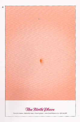
Belly Ache


This poster for a maternity clinic in California is by TBWA\VAN of Canada. I love this simple idea and execution, with the crux of the poster all about the way it's hung. This was going to be a quick post about one of my favourite pieces of design. That was until I did a quick google search only to find that the idea was pinched from elsewhere.


I can't say I'm surprised. I'll end this post with a link to an excerpt from Charlie Brooker's Screenwipe that put me off ever working in advertising. Watch it here.

Friday 28 August 2009

Toy Story 3 Teaser Trailer


For my generation, Toy Story is an institution. It was the first full length CGI film and is still one of the best. When Toy Story 2 came out it was one of those rare cases in which a sequel surpasses an original. No wonder then that Toy Story 3 is so hotly anticipated - and maybe that's why the teaser trailer has been released 10 months before the film will come out.

I think this teaser trailer ticks all the boxes. It reminds us of all the characters and their traits, it shows the power struggle between Woody and Buzz and most importantly it gets people talking about the film. The 1.1 million views on YouTube prove that people are excited.

Maybe I'm analysing a cartoon teaser trailer a little too much but I'm a bit disappointed that the ad breaks down the third wall. The fact that the characters are aware of the camera and aware that they're making a film weakens the effect. Personally, I would have preferred to see a sketch involving the characters but as I said, the trailer does it's job. I can't wait to see Toy Story 3.

Monday 24 August 2009

Bochox Injection


When I saw this brand in the supermarket, it jumped out at me. Packaging the chocolate as if it is a medical prescription is quite a nice little idea. The copy has been written with a good sense of humour:

"Active ingredient cocoa solids 75%"
"Warning - may cause weight gain if used incorrectly "
"If seal is broken, suspect everyone"

There are some similarities between this and the Spiritualized CD packaging I wrote about. I wonder what else you could sell doing a medial packaging pastiche? I find it interesting that this brand is selling this product solely on the idea - without any advertising etc. It reminds me of Elmwood who started competing with the big tea brands just because they had a good idea for a new brand of tea. It just shows how far you can get with a good idea.

Thursday 20 August 2009

Banksy vs Bristol


This is Banksy's first ever exhibition in his home town and I think he's really stepped things up since his book 'Wall And Piece'. I love the moving figures, and pieces like the chimp parliament shows that he is a really talented painter. I really like Banksy for his satire and his sense of humour.

LosLogos


"How does logo design react to the sociological, cultural, economic and technological changes that define our time?" LosLogos attempts to answer this question whilst at the same time providing a platform for "young global designers". 

LosLogos does exactly what is says on the tin - it is packed full of logos. What I like about the book is that it groups them by theme. There is a spread dedicated to logotypes designed using helvetica bold, a page of heart logos, a page of gun logos, robots, fire, animals, you get the picture.

My criticism of this book is that it seems to feature a limited number of agencies, each with their own style and this leads to similarities. Not quite the all encompassing ethic LosLogos claims in it's introduction.

However, this book is massively inspirational to me, and was especially useful during my year in industry when I was involved in quite a lot of branding exercises.

Saturday 15 August 2009

QUAD Derby


Derby isn't known for it's architecture so the new £11m film and arts centre 'QUAD' that opened in September 2008 really stands out in the city centre.

Looking into the architectural firm Fielden Clegg Bradley that designed it, I found that they are also responsible for 'Broadcasting Place' on Woodhouse Lane in Leeds. - that's the one we've all walked past saying "is it supposed to be rusty?". (It is).

Back in Derby, I like the way the slanted stone cladding looks like a piece of Derbyshire sedimentary rock. Inside, "QUAD is a gallery, cinema, cafe/bar, and workshop that anyone can use, and aims to be an organisation and building that is of local, national and international significance" as the press release says.

I think this is a great development for Derby, not only because it looks stunning, but also because it provides the area with a centre for the arts. I'll top and tail this post with some photos that I took.


Thursday 13 August 2009

How Do You Spend Your Day?


Displaying data graphically is a huge part of visual communication, and this is a great example of it being done well.

This fascinating interactive graph, posted on the New York Times website, is the result of 2008's American Time Survey in which thousands of Americans over the age of 15 were asked to log every minute of their day. The interactive nature of this graph means you can filter the results for different groups of people as well as find specific data. For example, I have discovered that even in 2008 men spend more time working than women and that white people are more likely to have set meal times than black people who's time spent eating and drinking is more spread out through the day. I don't know why I'm interested to know this and I certainly can't explain why it's true but I could spend hours playing with this graph.

Wednesday 12 August 2009

McDonalds Leaflet


I suppose if you're one of the biggest companies in the world you can afford to employ decent designers. I liked this McDonalds leaflet as soon as I saw it. It gives information about the ingredients of a BigMac so each page is a different layer of the burger and is cut with a separate die. Just a clever, simple little idea, but done really well.

Monday 10 August 2009

Rankin Live

Rankin is THE portrait photographer to the stars but his latest project 'Rankin Live' turns the camera on the British public. He's photographing 1000 people and displaying the results at an exhibition on Brick Lane in London. The other twist is that the photographs are being printed and hung at the show within 15 minutes of being taken as well as being uploaded to the Rankin Live website at the end of each shoot. Rankin is looking for people "with a distinctive style, sense of British eccentricity and enthusiasm" but anyone can apply. At the moment he is just under half way through the project, having shot 476 of the 1000 portraits.

There's a strange parallel to Antony Gormley's piece of work that I wrote about last month in that the focus is on members of the public - maybe that's the theme for art in 2009. I like the website with its bizarre celebrity-adorned flash video intro that features Jarvis Cocker among others.


Thursday 6 August 2009

Challenge Swound!

In a strange Danny Wallace meets Radiohead mix-up, Nottingham based band 'Swound!' are selling their album for a price of your choosing but only once you have set the band a challenge. The results can be seen in the form of videos on their 'Challenge Swound' website. So far they have asked a chip shop to deep fry some Haribo, spent a whole day in Derbyshire village Eyam, faked an alien sighting and been to try and find the Loch Ness monster among other things.

Meanwhile Steven Fry went on record at the iTunes Festival in London last Monday saying consumers who download copyrighted material for free should not be treated as criminals. Personally, I really respect artists, like Radiohead and Swound!, who embrace the ever changing way in which consumers purchase music. Top marks to Swound! for that reason and also because this stunt is dead funny. Oh and their album - 'Hello Future, We Are Swound!' - is great too.

Wednesday 5 August 2009

Welcome To Britain


'Welcome To Britain' is a book of photography by artists Jan Williams and Chris Teasdale who seem to have travelled the length and breadth of Britain, snapping anything that catches their eye. Their images take a look at what it means to be British with a big focus on eccentricity - the book could easily illustrate Kate Fox's 'Watching The English'! Many of the images capture the downright ugly rather than seeking the picturesque and the work's power often lies in the the couple's witty observations.

Williams and Teasdale don't display their work in conventional galleries but rather in their own mobile Caravan Gallery which seems fitting to me.

I love this ironic sign, it sums up not only the type of work that these artists do but also so much about the British - our cynicism, our eccentricity and our sense of humour.

Tuesday 4 August 2009

James Lockey

James Lockey is a film maker from Doncaster who is heavily involved in the South Yorkshire DIY music scene. He has provided music videos for bands including 'White Belt Yellow Tag' (who feature James' brother Justin on guitar), 'Above Them' and for his own band 'The British Expeditionary Force'. 

I think it's fair to say that James Lockey has a certain style but I really like the way he plays with the depth of focus in his films. I also like the old shot-on-film-stock quality, despite being shot in HD.

I really respect the whole scene of artists here, who are making some fantastic music, these beautiful looking films and doing it all with a great 'do it yourself' work ethic.

Monday 3 August 2009

MTV ident


MTV recently rebranded with the task undertaken by Universal Everything who after recently designing Warp Records' new website seem to be the go-to firm for hip music companies. The rebrand encompassed the logo, new typefaces, the channel's sound as well as idents. I love this 'Mad Drummer' ad. I first came across it when it was played on the big screens at a music festival I was at. In term of sound design, I think this is brilliant - what a great drum sound! The 2D animation is cool - I like the subtle pulsating MTV logo. It's also quite inspiring because the animation seems within my reach as a design student.

Wednesday 29 July 2009

Revolutions Exhibition


Back in April, I went to see this exhibition about the album cover in The Civic Gallery in Barnsley. This is a subject that brings together my two greatest passions - graphic design and popular music - and I'm pretty sure this will be the subject of my dissertation.

The album covers were laid out in chronological order, starting with the first ever illustrated album cover designed by Alex Steinweiss in 1939, and going through to releases from 2009 such as Roots Manuva's 'Slime and Reason'. The show also covered four formats: vinyl, cassette tape, compact disc and digital releases.

The exhibition had some brilliant pieces of design on display. The Rolling Stone's 'Sticky Fingers' LP from 1969 designed by Craig Braun and Andy Warhol shows a crotch complete with real zip. 


I liked Peter Saville's design for New Order's 'Unknown Pleasures' - it often tops the Top 100 type lists.


My favourite piece of music packaging ever is for 'Ladies And Gentlemen We Floating In Space' by Spiritualized, designed by Mark Farrow's design house in 1997. My older brother was a big CD buyer in the 90s, and knowing he owned it, I raided his collection to take a closer look. 


I think the packaging is so brilliant because it takes the pill analogy and carries it through immaculately. From the silver foil blister pack containing the CD 'tablet', right down to the 'Patient Product Information' booklet.

The copy writing is superb. The musicians are 'active ingredients', the recommended dose is to 'play once, twice daily', and the possible side effects include 'delirium, a sense of intoxication and visual and auditory hallucinations'.

The exhibition was excellent, concise without missing anything important out, and who knew Barnsley had such a little gem of an art gallery? I could write about this subject all day, but I'll stop here. Hopefully I'll be able to write 10 000 words on the topic for my dissertation.

Monday 27 July 2009

Boom! T-shirts Website


Boom! T-shirts' online shop is a website that is really making use of Adobe Flash CS4s new 3D capabilities. Normally I might think this was backwards design ("ooh look what our fancy new piece of software can do, now how can we use it") but this site genuinely has a sound little concept for showing off t-shirts and it has been executed really nicely. What's more, this is clearly made by graphic designers, for graphic designers and in these cases companies really have to pull out all the stops in order to impress.

Well, it's really impressed me. Check out the 'About' section too - it's written with a really nice tone of voice.

Sunday 26 July 2009

BBC Radio Branding

I love to see a good, consistent brand. When the BBC brought the branding of their different radio stations into line a couple of years ago, I think they did a really good job (it was done in-house).

This is how they looked before: disparate and a little bit stuck in the 90s.


The new set uses the Radio 1 logo as a starting point and takes it from there. I love the cleaner, refreshed look, each logo clearly under the same umbrella brand but also managing to keep a character of its own. There are some clever little graphical elements that communicate the nature of each station too. I also love the font used for the numbers - though I'm having a hard time identifying it. 

If I had any criticism it would be that the concept for the Radio 3 logo is executed a little clumsily. I think that the Radio 7 logo is the weakest - I don't like the rounded corners of the 7 and the smile is quite hard to read.

Overall I think it's a really successful overhaul. The BBC can be a bit of a straight-laced organisation at times so these could have been a lot safer. Actually, the logos retain a lot of character while still clearly belonging to the same brand: no mean feat.


Saturday 25 July 2009

Antony Gormley's One & Other


Antony Gormley is probably most famous for his sculpture 'The Angel Of The North', but he has been creating artwork for 25 years. Gormley's sculptures are often human figures. His last project was 'Event Horizon', when 31 of his figures were placed in prominent locations around London. His latest piece of work is called 'One & Other' and his idea is quite simple: for 100 days, 2400 members of the public will stand for one hour each in Trafalgar Square on top of 'The Fourth Plinth' - an empty statute stand built in 1841 that was never filled due to lack of funds. The whole thing is streamed live on a 24 hour webcam.

This is how the man himself explains it.


The project is 3 weeks in and I think this is a great piece of art. I like the collaborative nature of it - it can be whatever the British public make of it. So far people have have been doing some really interesting things for some very worthwhile causes - charity is often the main theme. I think this is something our country can be proud of.

Wednesday 8 July 2009

Animal Serifs

My all time, desert island, top two logos with serifs changed to look 
animal-like, are...
and
This is going to be quite a short post because these logos speak for 
themselves but I think they're clever. I wonder if this concept can or 
will be used again? Also, I would like to nominate Century (used in 
the for the Bulldog logo I think) for the font with the coolest lower 
case 'g'.

Tuesday 7 July 2009

Logotournament.com

This post is about a website that I got quite addicted to in April called Logo Tournament. The basic premise is that when a company wants a new logo, they set up an online competition and designers submit entries of their logo designs. The contest holder picks a winner who earns a pre-determined sum of $250 or above. If there are fewer than 30 entries, the holder gets their money back. Simple.

I heard about the site through one of Facebook's targeted ads - which I invariably ignore. What was different about this one I wonder? Whatever it was, I immediately thought this sounded like a cool idea and started submitting entries. Despite having a 9 to 5 job in Sheffield, I put in a fair amount of time into this new venture, often working on the train to and from the office. Within 2 weeks I'd won 2 competitions and, to my surprise, actually seen payments go into my paypal account (minus the website's commission) that added up to a little over 300 quid.

You can see my entries here. One of my winning logos was for an American iPhone App development company who are now using the logo on their website, although I don't like the design of their site. My other successful entry was for a skate shop also based in the U.S who have used a part of my design on their website too, again in pretty bad taste.

The more I think about Logo Tournament though, the more doubts I start to have. For what the client gets - often hundreds of different logo designs - it's very good value for money. Maybe a site like this cheapens the art-form of graphic design. On the other side of the process, good designers can put hours in and only one designers earns any money.

I do think there are some positives: quite a nice little online community, fledgling designers being able to work on real briefs, established designers having a punt for fun, the client having a big choice for a small amount of money.

I stopped going on Logo Tournament after about the third week, mainly because I didn't have time but I might start submitting entries again. Anyone else have any thoughts? Is Logo Tournament cheapening design as a trade or mutually beneficial for both parties?

Monday 6 July 2009

The Greengrocers At Converse Don't Polish Their Apples


I really liked this advert for Converse All-Star trainers. It's just really simple - someone wearing the shoes at a music festival. It's almost as if they're just showing us the type of person and the setting that they see their trainers being in. Converse All Stars and rock music have got a history together - from John Travolta in Grease to Kurt Cobain - and the company are playing on this fact.

I think it's really intersting that the trainers in the shot are dirty. We all know Cons look better after a bit of wear and it looks like Converse now know it too. I've been trying to think of other situations in which the product in an advert would be worn or used and I'm struggling. In a world where images are so often CGI or retouched to death I like the fact that this is going the opposite way.

The advert manages to convey so much and all without words - it's universal enough to work in any country. I think it's a good piece of work.

Sunday 5 July 2009

The School Of Athens


Time for another Rome-with-Professor-Hann-link blog post. The facts... The School Of Athens is a fresco painted by Raphael in 1510 and is located inside a chapel in Vatican City. It depicts a lot of well known Greek philosophers. Plato stands in the middle, pointing to the sky. Next to him Aristotle holds a copy of his book Ethics. Pythagoras can be seen on the left teaching his mathematical theories. On the right Euclid (the so-called father of geometry) is drawing with a pair of compasses. I think this is the reason that professor Hann used to show us this painting nearly every lecture. I especially like how Raphael has painted himself into the scene over on the far right, looking out at us wearing a black beret. Another point of interest is Raphael's sound use of perspective. All the lines of the building converge to a vanishing point - a technique that was largely absent from artists' work before the Renaissance.

I was inspired by this painting because for a start I knew a bit about it already and seeing it in real life really made an impression on me. The painting must be a sort of personal tribute to Raphael's heroes - he was apparently well versed on Greek philosophy. It's also interesting that it is Pagan subject matter in a Christian chapel. I also love portraiture and this was some of the best I've ever seen.

The Pantheon, Rome

Yesterday I got back from Rome. I know the brief for this project specifically states that this blog shouldn’t be ‘a collection of summer holiday snaps’ but in terms of creative and cultural inspiration, Rome just can’t be beaten.

The first thing I want to write about is something that came up in Professor Hann’s architecture lecture in second year Design Theory: The Pantheon. The Pantheon was built in 25AD by the Romans and is famous for its incredible dome. The dome is 43 meters in diameter with a 9 meter wide hole, or oculus, in the centre which is the building’s only source of light. I read that a sphere would fit perfectly inside the dome – the dimensions are accurate to the millimetre.

The reason I find this building so great is thinking about the engineering feat that was achieved over 2000 years ago. The dome is made of concrete (a material that Prof Hann told us the Romans worked out how to make and then mankind forgot how to make) and tapers from 6 meters thick at the base to 1 meter thick at the top. The weight bearing supports are hidden inside the walls. It is still is the largest un-reinforced concrete dome in the world. I think the level of technology achieved so long ago is pretty amazing. When it rains though, the floor under the oculus gets wet. Is that bad planning?

Sunday 4 January 2009

Some logo designs

I saw an article on vectortuts.com called "20 Wierd Logos That Work (and Why They Do)" posted in Jan 2009. The guy who posed it is a freelance designer from Sheffield called Chris Spooner. While his descriptions of the logos were pretty limited, he picked some nice ones.

 
The London Symphony Orchestra logo. You can see a conductor holding a baton here.


... or "umop episdn" rotated by 180 degrees.

There's an 'S' and an '8' in this logotype.


This clever typo arrangement reminds me of some of Herb Lubalin's work from the 70s.

This logo shows why it's hard for me to write any more than a sentence for each image: a good logo doesn't need explaining.

I've just picked five of my favourites from the list but I think these are quite inspiring logo designs. Wouldn't it be great if your job was to design a new logo each day...