Wednesday 30 September 2009

Nobles Yard


Nobles Yard is a new build project tucked away in a small Derbyshire town designed by The Rennie Partnership Architects.

The building looks strikingly modern to be in a region that's a conservation area. The project was designed to be as eco-friendly as possible in its building and running.

The timber-frame construction uses recycled wood and creates a highly insulated cavity wall filled with recycled newspaper to keep heat in. This cuts down on how much the building needs to be heated, thus saving energy.

Rainwater collected from the roof is recycled, filtered and then used to flush the house's toilets.

The roof is planted with seedum which acts as a good insulator, slows water run off and provides a habitat for insects.


Photovoltaics on the roof generate electricity that powers the building and any excess energy is sold back to the grid.


The fact that this building was completed in 2001, shows the foresight of the architects for using technology that at the time was fledgling, and still isn't used widely enough in construction today.

Tuesday 29 September 2009

Bridgewater Place


Bridgewater Place is the tallest building in Leeds. Fact. I assumed that the new Plaza block would have taken this title but apparently not. 

This building holds a little place in my heart. Wether it be driving up on the M1 or coming into Leeds station by train, I still get a little jolt of excitement whenever I see it, especially when it's lit up with purple light at night for some reason.

For me it's like a little beacon that I see from afar that says I'm nearly in Leeds, a city that I'm massively fond of.

Bridgewater Place was designed by Aedas.

Monday 28 September 2009

Gay Icons


Whenever I'm in London (which is admittedly rarely) I always seem to end up at the National Portrait Gallery. It's free, near Trafalgar Square and it's got some cracking stuff in it. On Saturday I went and had a look round the current 'Gay Icons' exhibition.

The premise: ten prominent gay figures of modern society each choose six people who is an icon to them. The exhibition comprised of photographs of the icons along with why they were chosen. The selectors included Ian McKellen, Sandy Toksvig and Elton John.

The selections brought up some fascinating figures – male, female, some gay, some not but all interesting.

Some were well known (like John Lennon and Nelson Mandella), some were not so (like 20th century novelist Ronald Firbank), some were clichéd (Village People, Quentin Crisp) and some were just bizarre (football manager Graham Taylor?).

Here's one of my favourites:

Peter Tatchell, a human rights and gay rights activist, made headlines in 1999 and again in 2001 when he attempted to put Robert Mugabe under citizen's arrest. I think that really does make him an icon.

The exhibition really was put together well, with it's stylish purple and grey backdrop. If I had a criticism, it would be that some of the photographs of the icons weren't fantastic (some were just taken from stock image libraries). However, the exhibition wasn't solely about that, it was about bringing the identities of some great figures to the fore, and it did that very well.

Hail Mary

I'm fresh back from a weekend in London and after visiting the usual suspects of haunts, I'm full of inspiration. I love the Tate Modern on the south bank of the Thames. While I was looking round, this piece really stood out.

Often the intention of a piece of art is to shock - I think this sculpture by Maurizio Cattelan ticks that box.


The blurb told me that the Italian's pieces are often "interventions" that create a "disruptive or unnerving effect" in a room. This piece was sited in the same room as a version of Rodin's 'Kiss' and a Picasso painting from his blue period.

A room of pre First World War art juxtaposed with the three Roman salutes that have "become synonymous with the authoritarian political movement" is designed to remind us of us of the horrors that were to come.

The title, 'Ave Maria' (translated as Hail Mary) is based on the biblical reference of Angel Gabriel' s salutation to Mary, and also plays on the double meaning of the word Hail.

Wednesday 23 September 2009

André Michelle

André Michelle is a Flash developer whose cool retro-looking website is full of projects that as far as I can see, he has developed for his own purposes. He is really pushing the boundaries of what Flash can do, often working within the audio-visual domain. He has created adjustable flangers, adjustable EQs, a scratchable record and a host of other mind boggling audio flash toys.

My favourite is the Tonematix.


Each square on the horizontal axis represents a beat in time, while the squares on the vertical axis vary in pitch. Just select and highlight a selection of squares and listen to your creation. You can work out a musical composition or literally hear a pattern but as the tonematrix uses a pentatonic scale, it always sounds great.

It seems Mr Michelle is well respected within his field too - he was a guest speaker at this years 'Flash On The Beach'. I urge you to go and have a look round his site and play with his inventions, the only downside is how long you could spend there.

Wednesday 16 September 2009

Charity Logos

I recently did a run so I spent a long time looking at the back of people's t-shirts. I noticed a bit of a theme with these two charity logos that I saw around on a few people's backs. 


Both these logos manipulate letter forms to communicate something about the diseases the charities raise money for. In the Bowel Cancer UK logo, the letters B and C combine to make a quite a literal shape while the jolt in the letter M of the Multiple Sclerosis Society logo gives a more figurative impression of the disease that affects the nerves ability to send signals.

I like seeing design work that's done for charities - it's often really good stuff. I always think the Amnesty International campaigns a well done. I think design firms feel they have to work that bit harder when working for a charity.

Tuesday 15 September 2009

Nexus Productions

Nexus are a Production Company and Animation Studio who have a great number of impressively talented directors and animators on their roster.

Clemens Habicht is responsible for this brilliant Friendly Fires video created (as the blurb on their website tells us) using nothing more than polystyrene balls, fans and sticky tape.


Two directors also on their books are Smith & Foulkes.  These two guys working from a small flat in London made headlines last year when they were nominated for an Oscar for their short 'This Way Up', and were pipped only by Pixar's WALL.E. Here's the trailer:


I love the way this animation looks different to a lot of CGI out their. It's grittier and darker and that compliments the black humour that us Brits do so well.

Thursday 10 September 2009

Fell In Love With A Girl Video


It's strange to think that this decade is coming to an end but it's true. And that means that there will no doubt be a wave of retrospectives heading our way. Prepare then for 'Top 100 Reality TV Moments Of The Noughties' hosted by Jimmy Carr. I came across an early example in the form of Pitchfork.com's 50 Best Music Videos Of The 2000s. In first place is this video by Michel Gondry and I think it's a worthy winner.

Gondry is an acclaimed director who is probably most famous for Eternal Sunshine Of The Spotless Mind but is a prolific director of music videos for some really high profile acts including Bjork, The Rolling Stones and Radiohead. You probably knew that already.

Some of my favourite music videos include:
Here It Goes Again by OK Go and
No Suprises by Radiohead.

Thursday 3 September 2009

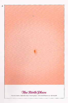
Belly Ache


This poster for a maternity clinic in California is by TBWA\VAN of Canada. I love this simple idea and execution, with the crux of the poster all about the way it's hung. This was going to be a quick post about one of my favourite pieces of design. That was until I did a quick google search only to find that the idea was pinched from elsewhere.


I can't say I'm surprised. I'll end this post with a link to an excerpt from Charlie Brooker's Screenwipe that put me off ever working in advertising. Watch it here.